Appearance
Draft System
A Draft is a data-collection form tied to one client (and usually one case) — used to gather all the information and documents needed to actually file something, digitally, with e-signature support. A Draft Template is the reusable form definition (sections + fields) that a draft is created from. This chapter covers both: designing a template from scratch, and then using it — creating a draft, filling it in, and reviewing it.
Draft Templates (the list)
What it's for
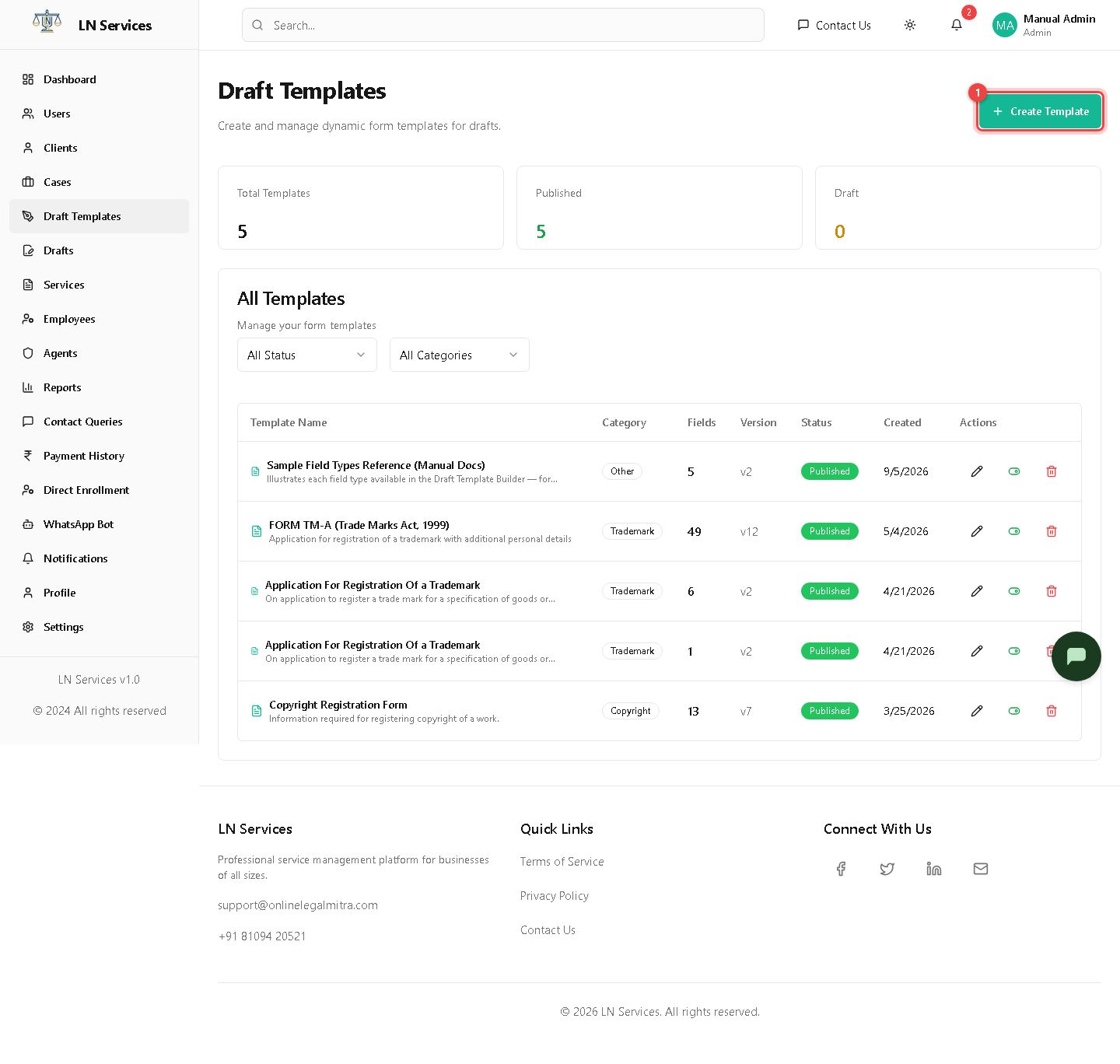
Browse, filter, publish/unpublish, and delete your form templates — e.g. "FORM TM-A (Trade Marks Act, 1999)" with 49 fields.
Steps: manage existing templates
Each row's action icons: pencil edits it, the toggle publishes/unpublishes it, and trash deletes it (after confirmation). Filter the list by Status or Category.
Technical Notes
GET /api/draft-templates, PUT /api/draft-templates/:id/publish, DELETE /api/draft-templates/:id.
Designing a template (Template Builder)
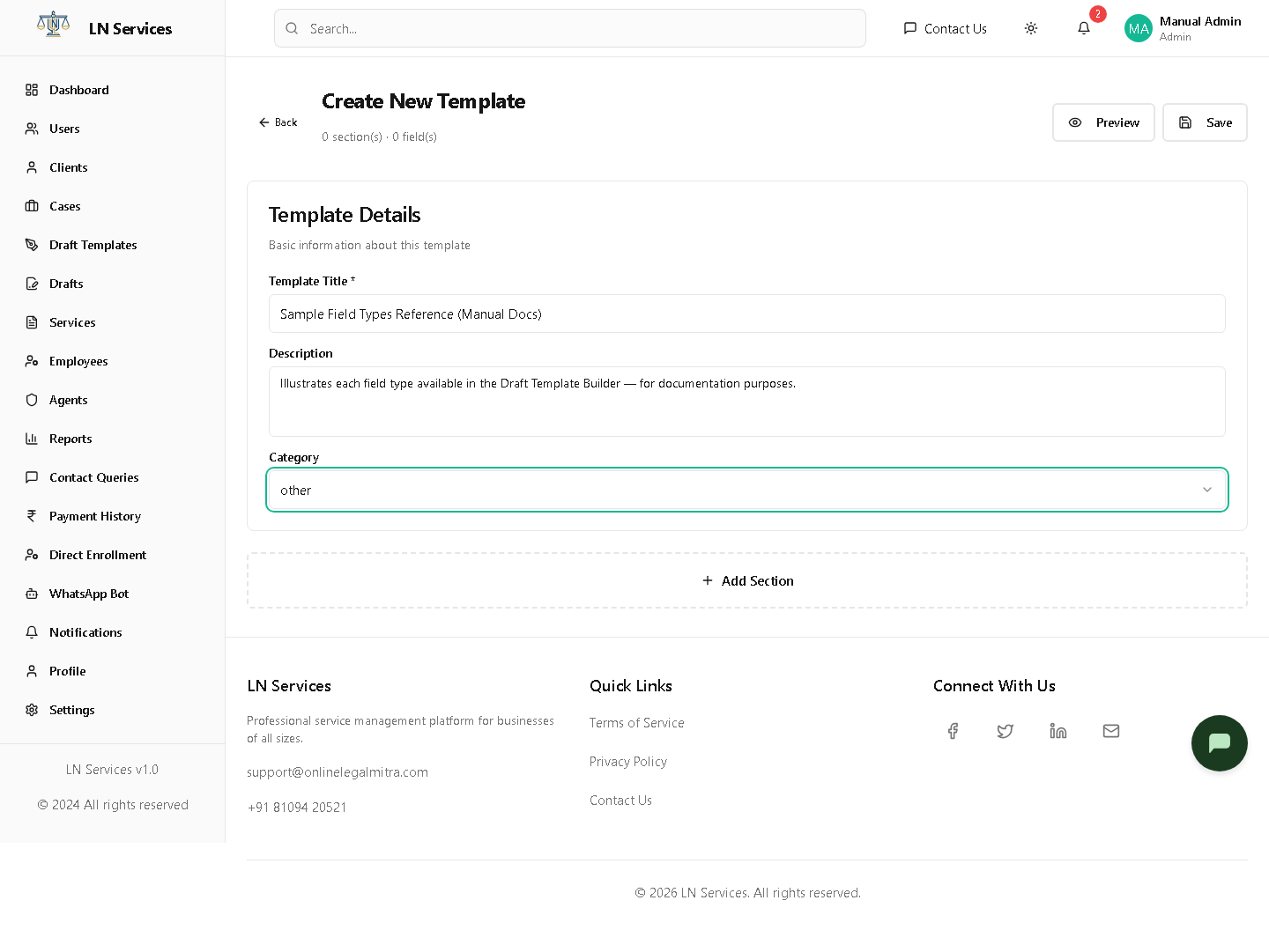
Click Create Template from the list above to open the builder. A template is just Title + Description + Category, plus one or more Sections, each holding one or more Fields.
Step 1 — Template details
Fill in:
- Template Title — required, shown to the client (e.g. "GST Registration Form").
- Description — optional, explains what the template is for.
- Category — one of the service categories (trademark, copyright, gst, msme, etc.) — mostly for your own filtering later, not shown to the client.
Step 2 — Add a section
Click Add Section. A section is just a labeled group of fields (e.g. "Applicant Details", "Business Information", "Documents") — click its title to rename it. A template needs at least one section before you can save it.
Step 3 — Add fields, and pick the right type for each
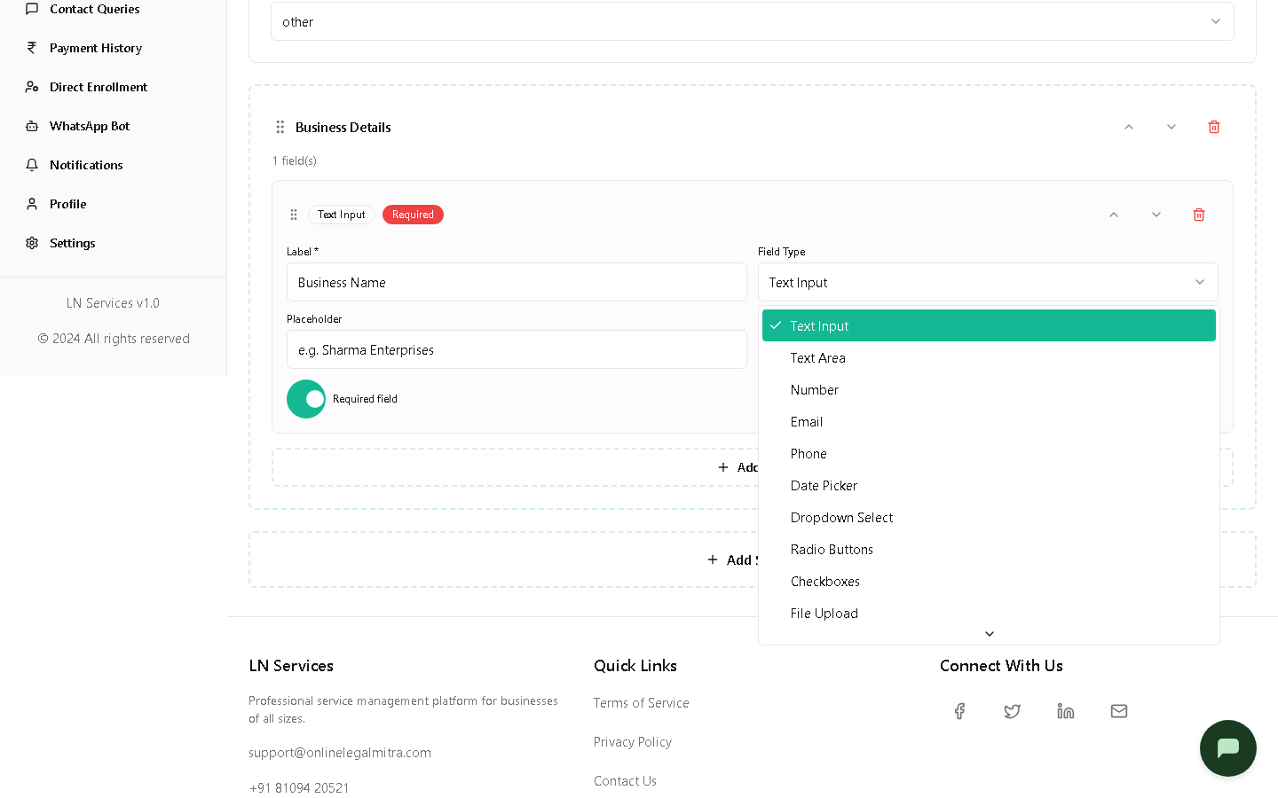
Click Add Field inside a section. Every field gets the same configuration boxes — Label, Field Type, Placeholder, Help Text, and a Required toggle — but what you should put in them depends on the Field Type you pick. Click the Field Type dropdown to see all 11 options:
| Field Type | What the client sees | When to use it |
|---|---|---|
| Text Input | A single-line text box | Names, short answers — the default type |
| Text Area | A multi-line text box | Longer free-text answers (descriptions, addresses) |
| Number | A number-only input | Quantities, amounts |
| An email-formatted input | Contact email addresses | |
| Phone | A phone-formatted input | Contact numbers |
| Date Picker | A calendar date picker | Dates (incorporation date, date of birth, etc.) |
| Dropdown Select | A single-choice dropdown | One answer from a fixed list (e.g. business type) |
| Radio Buttons | Single-choice radio buttons | Same as Dropdown, but all options visible at once — better for 2-4 short options |
| Checkboxes | Multiple-choice checkboxes | When more than one option can apply |
| File Upload | A drag-and-drop upload box | Documents — PAN card, ID proof, certificates |
| Signature | A signature canvas the client draws on | Wherever you need the client's actual signature |
Dropdown, Radio, and Checkbox fields need one more thing: an Options box appears once you pick one of these three types — type the choices as plain comma-separated text, e.g. Proprietorship, Partnership, LLP, Private Limited. There's no separate "add option" button; it's just that one text field.
Toggle Required field for anything the client must fill in before the draft can be submitted — it shows as a red Required badge on the field card and a red asterisk in the preview.
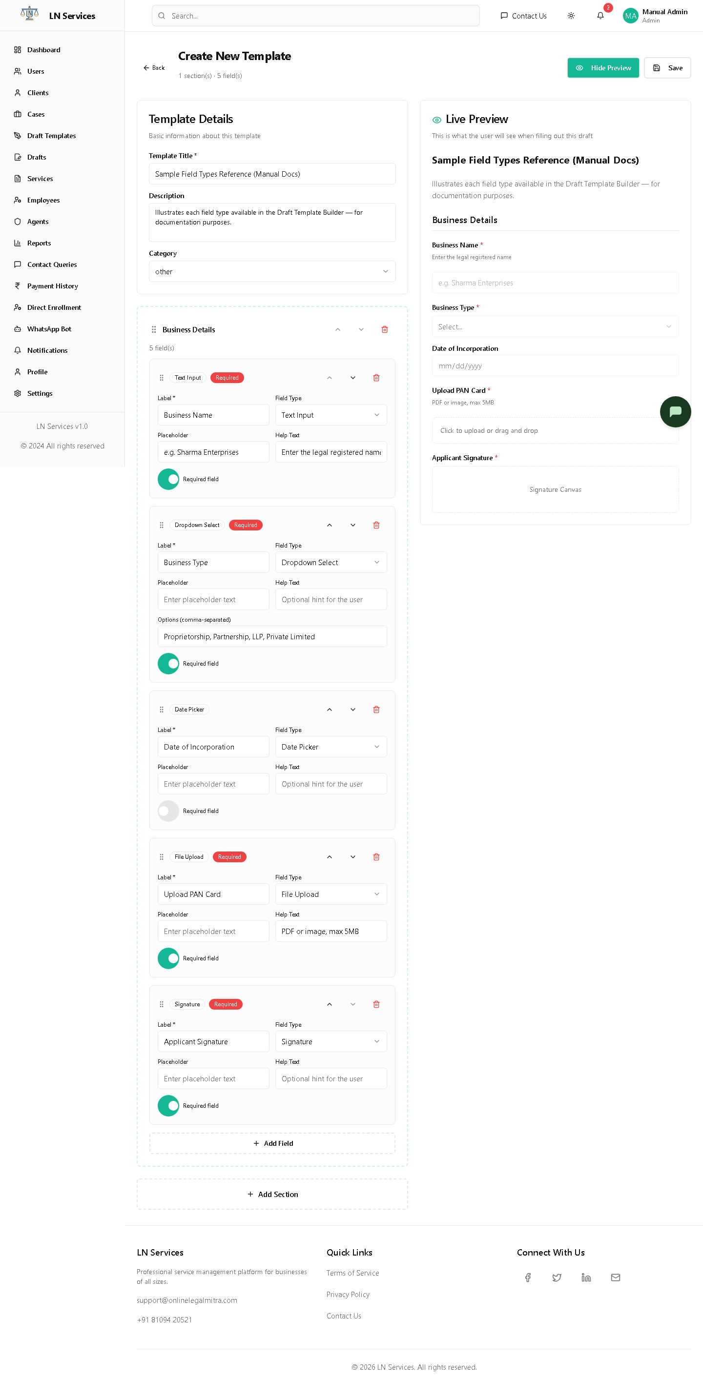
Here's a fully configured example section with one field of five different types, so you can see what each looks like once set up:
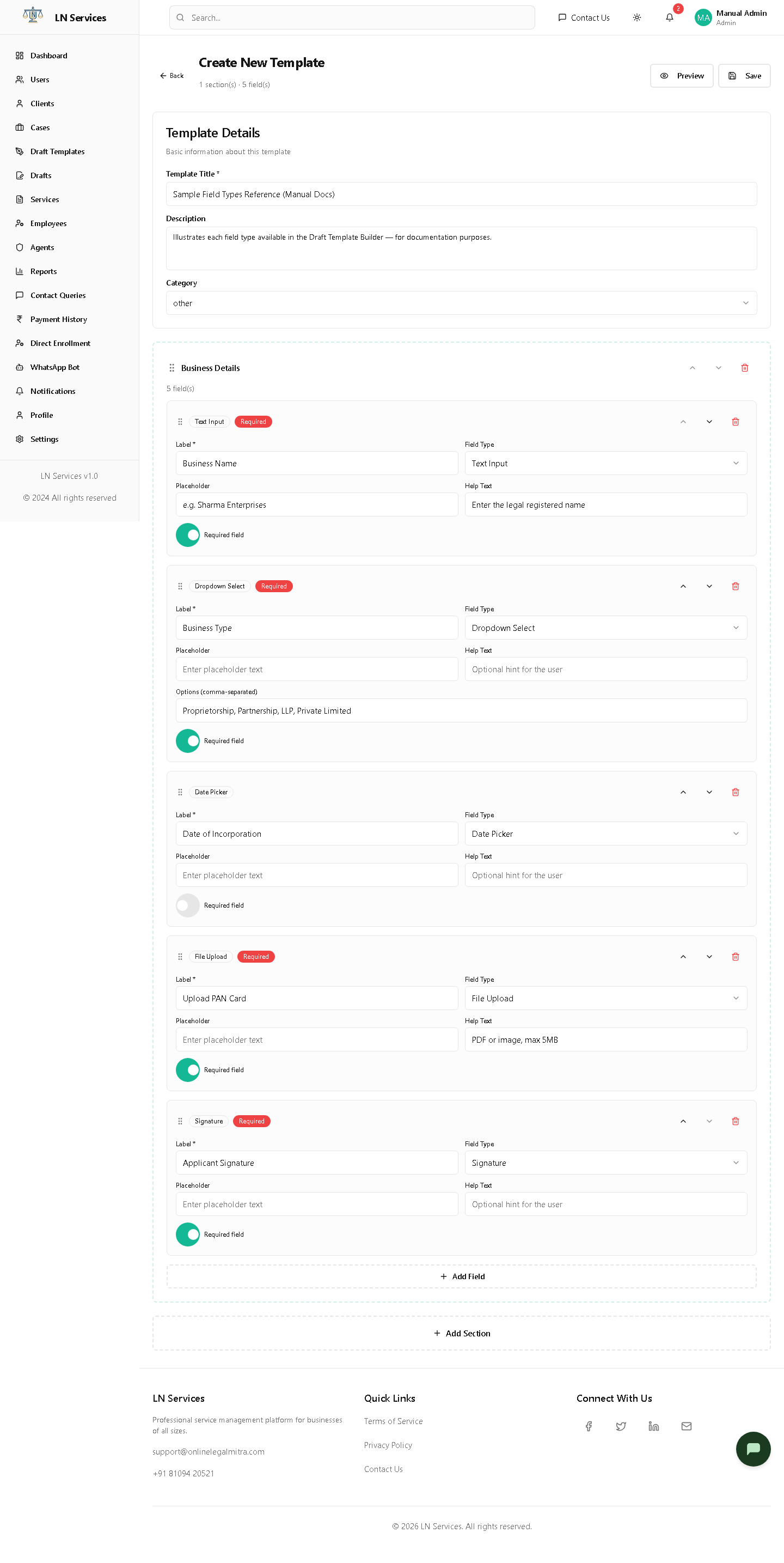
- Business Name (Text Input, required) — Placeholder
e.g. Sharma Enterprises, Help Text explaining what to enter. - Business Type (Dropdown Select, required) — Options
Proprietorship, Partnership, LLP, Private Limited. - Date of Incorporation (Date Picker, optional) — no options needed.
- Upload PAN Card (File Upload, required) — Help Text noting the accepted format/size.
- Applicant Signature (Signature, required).
Use the ↑ / ↓ arrows on a field or section to reorder them, and the trash icon to remove one.
Step 4 — Preview it
Click Preview at any time to see a live, read-only rendering of the form exactly as the client will see it, updating as you type:
Step 5 — Save, then Publish
Click Save first — this creates the template (or updates it, if editing) but it isn't usable yet. Then click Publish, which only appears after saving. Only published templates show up when creating a new draft — an unpublished template is invisible to the rest of the app, which is useful while you're still drafting it (no pun intended).
Technical Notes
POST /api/draft-templates (create), PUT /api/draft-templates/:id (update), PUT /api/draft-templates/:id/publish. Field types are the FIELD_TYPES enum in backend/utils/constants.js (text, textarea, number, email, phone, date, dropdown, radio, checkbox, file, signature) — the frontend's DraftTemplateBuilder.tsx hardcodes the same 11 as a local FIELD_TYPES array with display labels. The server rejects saving if any field is missing a label, or if a dropdown/radio/checkbox field has no options. A field's key (its internal identifier, used later to store/read its value) is auto-generated from the label the moment you type it — you never set this manually.
Drafts (using a template)
What it's for
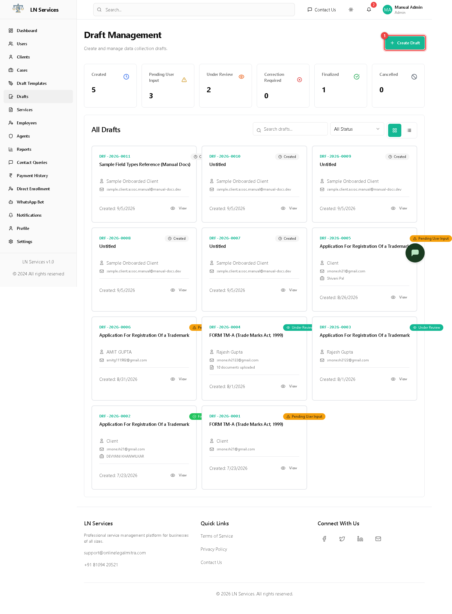
Create a draft for a specific client from a published template, and see every draft in progress across all clients.
Steps: start a new draft
- Click Create Draft.
- Pick the Template (only published ones appear here), search for and select the Client, and optionally assign an Employee to manage it.
- Click Create Draft — this opens the draft's detail page. The template's current sections/fields are copied onto the draft at this moment (a "snapshot"), so editing the template later doesn't change drafts already created from it.
Steps: open an existing draft
Click anywhere on its card (grid view) or its ID (table view, use the toggle buttons near the search box to switch views).
Technical Notes
GET /api/drafts, POST /api/drafts with { templateId, endUserId }. Status values come from DRAFT_STATUS in backend/utils/constants.js: created → pending_user_input → under_review → (correction_required ↔ under_review) → finalized, or cancelled at any point.
Draft details
What it's for
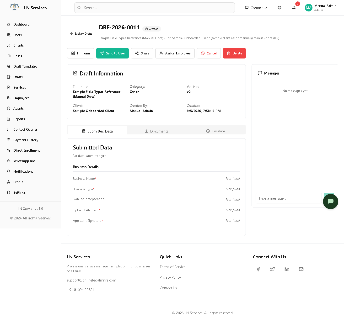
Review what the client has submitted so far, message them directly, and move the draft through its review workflow.
Steps
- Click Fill Form to fill in the form yourself on the client's behalf (useful when a client hands you paperwork in person or over the phone) — see below.
- Click Send to User once it's ready for the client to fill in or review themselves; Share → Copy Link or Share via WhatsApp gives them direct access without logging in.
- Once they've submitted, use Request Correction (with a note explaining what's wrong) or Approve & Finalize.
- Assign Employee hands ownership of the draft to a staff member.
- Use the message box on the right to communicate with the client directly on the draft.
Filling it in on the client's behalf
Click Fill Form to see the actual rendered form — this is exactly what the client's own fill page looks like, section by section, one type per field just as you configured it:
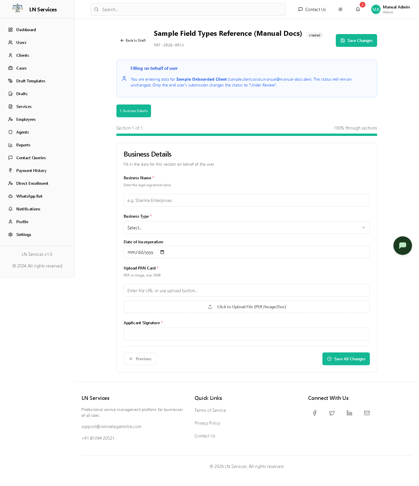
Notice this is the same "Sample Field Types Reference" template built above — the Text Input became a plain box, the Dropdown became a real select, the Date Picker a calendar input, File Upload a drop-zone, and Signature a canvas. A blue banner reminds you that filling it in yourself does not move the draft to "Under Review" — only the client's own submission does that (so you can safely help a client without accidentally short-circuiting the review step). Use the section buttons at the top or Next/Previous to move between sections, and Save Changes (or Save All Changes on the last section) to persist what you've entered.
Technical Notes
GET /api/drafts/:id, and per-action: PUT /api/drafts/:id/send, /fill, /review, /finalize, /cancel, /assign; messages via POST /api/drafts/:id/messages. Documents: GET /api/drafts/:id/documents/download-all or /documents/:docId/download. The "Fill Form" page (StaffDraftFill.tsx) and the client-facing fill page share the same PUT /api/drafts/:id/fill endpoint and the same DraftFieldRenderer component — staff and client see the identical form, just from different routes, which is why every field type behaves identically for both.